Why code-to-design is better than design-to-code for design systems
A lot of teams are currently working on design-to-code solutions with the promise of generating code from the designs, without a handoff process to developers. While there are several use cases for these solutions, we believe that actually the opposite, code-to-design, is the way to go when building design systems.
Design-to-code tools
In the past few months, a number of tools have emerged with the goal of generating code from design.
Some tools take designs from existing design tools like Figma, Sketch or Adobe XD, while others involve completely new design tools that designers need to learn.
Where design-to-code tools shine
Design-to-code tools are amazing and, in my humble opinion, useful in the following use cases:
- High fidelity prototypes
- Content-only / Small scale websites / Landing pages
And this is probably also how Framer sees it, as they market themselves as a design tool with prototyping capabilities and recently released Framer Sites to build websites.
But let’s keep in mind that the website builder market is extremely crowed with tools like Webflow, Wix and a hundred more landing-builder solutions.
There is more than meets the eye
Visual fidelity is hardly a problem for design-to-code tools. They are successfully reproducing design through elegant translation of design to HTML and CSS.
But what about the invisible elements?
- Accessibility
- SEO
- Code performance
- Code maintenance / readability
Unfortunately, some of these are extremely complex to solve programmatically.
Accessibility
Visual accessibility, like color contrasts, can be managed in design without trouble.
But visually impaired users rely on screen readers to successfully understand and navigate a website or app.
Screen readers need semantic HTML content and keyboard navigation requires carefully defined aria attributes, as described in WAI-ARIA Authoring Practices.
One of the most iconic example of accessibility is the navigation menu.
All websites or webapps have them. Screen readers needs to identify it as a navigation element to go to other pages and keyboard navigation is mandatory to select the right entry in the menu.

In best case scenario, most design-to-code solutions will generate the following HTML:
<div>
  ...
  <ul>
    <a href="/"> Home </a>
    <a href="/products"> Products </a>
    <a href="/about"> About </a>
    <a href="/pricing"> Pricing </a>
  </ul>
</div>
As describe in WAI Menu Structure, an <nav> HTML tag must be used, ideally with a list of links. There is also a number of aria attributes that should be used to help screenreader understand the semantic of each element.
Example:
<nav>
	<ul id="menubar" role="menubar" aria-label="Navigation">
    <li role="none">
      <a role="menuitem"
         href="#"
         tabindex="0">
        <span class="visuallyhidden">Current Page: </span>Home
      </a>
    </li>
    <li role="none">
      <a role="menuitem"
         href="#"
         tabindex="-1"
				 aria-haspopup="true"
         aria-expanded="false">
        Product
      </a>
    </li>
    <li role="none">
      <a role="menuitem"
         href="#"
         tabindex="-1">
        About
      </a>
    </li>
    <li role="none">
      <a role="menuitem"
         href="#"
         tabindex="-1">
        Pricing
      </a>
    </li>
</nav>
In a nutshell:
<nav>tells it’s a navigation element.role="menubar"tells it behaves like a menu of choices.role="menuitem"tells it’s an item in the menu.class="visuallyhidden"tells is hidden visually but the screen reader should read it.aria-haspopup="true"&aria-expanded="false"tells that there is more to it.
Without these extra details, the screen reader can’t provide a good enough experience to list and select an item in the navigation.
These extra details can’t be inferred from the design. It requires additional information about the semantic of the UI to generate proper code. At this stage, design is not in free flow anymore.
SEO
One of the fundamentals for SEO is that search engine bots should be able to crawl and index the content of your website.
Again, like accessibility, the semantic of the HTML needs to make sense so it can can be indexed properly.
A simple illustration of the problem can be drop caps or initials.
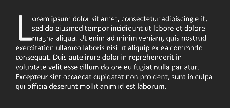
To do this effect in Figma we have to create 3 parts:
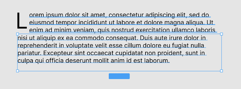
-
Capital L
-
3 lines of text to the left of the L, without the first letter
-
The rest of the text below the first 2 parts
Visually, everything is here. But design-to-code tools will create 3 separate paragraphs of text in the output code:
<p>L</p><p>orem ipsum.../p><p>nisi ur aliquip...</p>
Search engine bots will index the 3 parts separately and this can be problematic. For a paragraph of text, the impact can be minimal but if this happens for the <h1> title, or more critical keywords, it will severely damage the search performance of the page.
Imagine the effect of this on accessibility. Screen readers will read these 3 separates paragraphs as different sentences. Visually impaired users will be negatively impacted.
This is can be done in code by styling the first letter of the paragraph using CSS.
Code performance
At least in my humble and limited experience with existing tools, none of them generate high-performance code. They usually generate a 1-to-1 interpretation of the website with lots of runtime JavaScript.
That being said, there are future opportunities for these tools to generate extremely optimized code that even the best engineers can’t match.
Meanwhile, performance of websites is increasingly important for SEO since Google introduced Core Web Vitals.
Again, it’s not an issue for prototypes or MVPs, but it’s a major issue if you want to be well ranked in search engines and if you want to provide a qualitative experience for everybody, even if they have a slow network or an entry level smartphone.
As discussed by Fast Company in 2012, One Second Could Cost $1.6 Billion In Sales - and it’s still very much true in 2022.
Code maintenance/readability
Code maintenance/readability is often raised as a problem with code generation tools but if you do all your work in the design, then it’s all generated and doesn’t need to be maintained or read.
I don’t classify this as a showstopper.
Design-to-code creates constraints on design
As seen previously, Accessibility and SEO need special care. Designers would need to add hints or new information to design frames. They would need to carefully structure the design so it can generate code properly.
This kills freeform design as designers need to constantly structure, de-structure and restructure their design for code generation. It will slow the design process and limit the amount of design research applied.
Why is freeform design important?
Freeform design is the superpower of designers.
Freeform design is where the magic happens. Creativity flows best when it happens freely. Designers need to iterate: do, undo, redo, try different variations, feel it, pick up the best ideas and narrow down to the final design.
Designers can’t be bothered with structure in freeform flow. They can’t be constrained by invisible requirements.
During Schema 2021 (Figma’s conference about design systems), Sho Kuwamoto, Director of Product at Figma, made a beautiful opening keynote about design systems, where he presented Figma’s vision about freeform design, structured design and code.
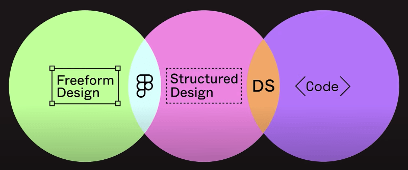
This elegantly represents the freeform aspect of Figma and how design systems are the link between code and structured design.
I recommend to watch the video:
Structured design is a lot of maintenance
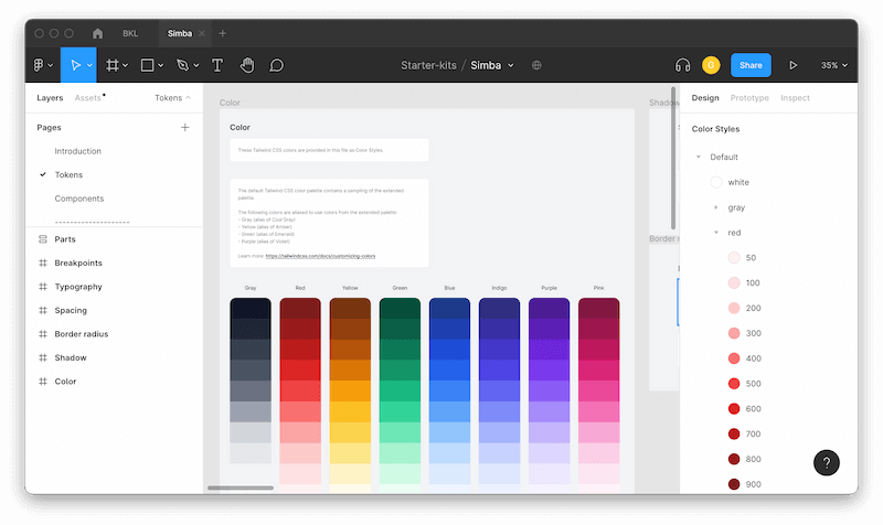
Structured design is where the tokens and components live. This is the UI kit-side of the design system.
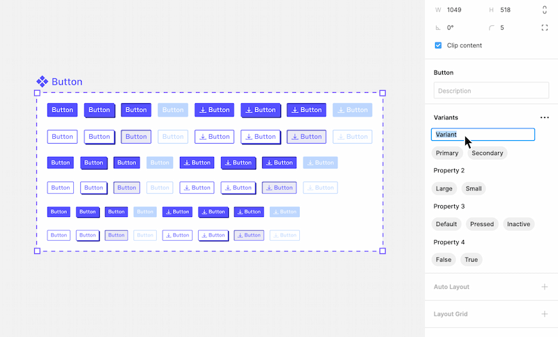
With components sometimes having more than 1000 variants, the maintenance can be extremely time-consuming.
- How much time does your design team spend on maintaining the components in Figma?
- Is the team maintaining the design system during the weekend so they can be designing new features during the week? (True story!)
What if you could generate and maintain structured design (aka the component library) from code automatically and focus 100% on creativity and research?
What do we have code-side?
As defined in our definition of design systems, the component library is the code-side sibling of the design kit on the design side.
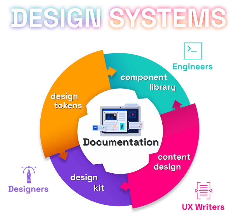
All reusable components of the design system are defined in code - ready to be reused by engineers.
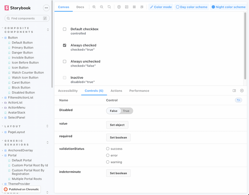
Component-driven development has been democratized by Storybook in the past few years with the introduction of stories and CSF format.
All component variations are defined and visible in a catalog website, also called “Storybook”.
Last year, we introduced Backlight to the world: a development platform for design systems, that also uses stories in the same CSF format.
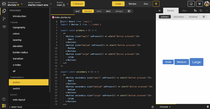
Teams have the same components in UI kits design-side and in stories code-side. Maintaining both is a lot of work. Generating the UI kits on the design-side from the stories sounds like a perfect fit!
We built the first code-to-design tool: story.to.design
After months of prototyping to test feasibility, we finally created story.to.design!
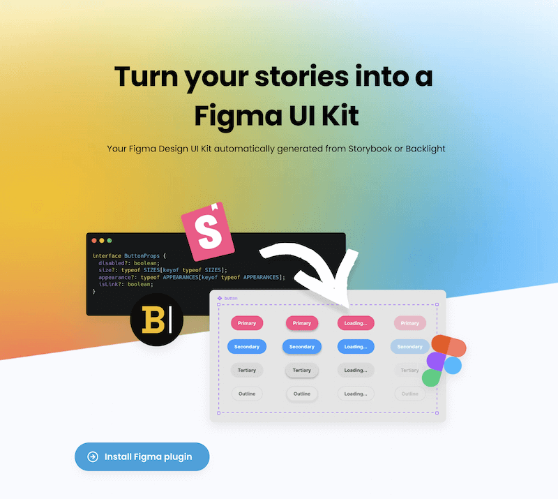
story.to.design is a Figma plugin that generates your Figma UI Kit from the code in Storybook or Backlight.
It not only generates all variants of a component from story args, but also updates them after a code change. No need to update thousands of variants manually after a new release of the design system code-side.
We believe designers should express creativity and research in full freeform and get the structured design from code automatically.
Read story.to.design announcement post
