The story behind ‹div›RIOTS branding
-

- Name
- Pierrick
- @S3kelman1
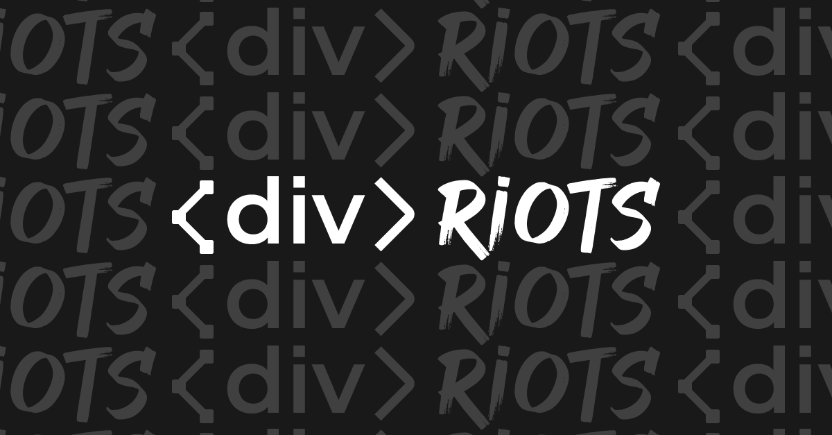
The story behind our new Visual Identity
While it’s true that a good brand name is often defined by the success of the company that carries it, ours is one that the team carries with pride. We believe it encapsulate everything we stand for while showing our true colours : we are on the code side ! All we needed was a visual to show it to the world.
In our mission to unleash front-end creation, the first step is to close the gap between Developers and Designers, empowering teams with new tools that let them focus on what really matters : deliver better product, faster. Our branding needed to reflect just that, the mix of 2 worlds, Developers and Designers, combined with the coming changes that ‹div›RIOTS is bringing to the Front-end world.
We all had ideas, it’s an exciting time, we were writing history! Compiling every one ideas wasn’t an easy job, —democracy is tough —and as each draft was downvoted by some or applauded by other, we could see some pattern emerging. With help from the CosaVostra agency we turned these pattern into different visual variations and here it was:
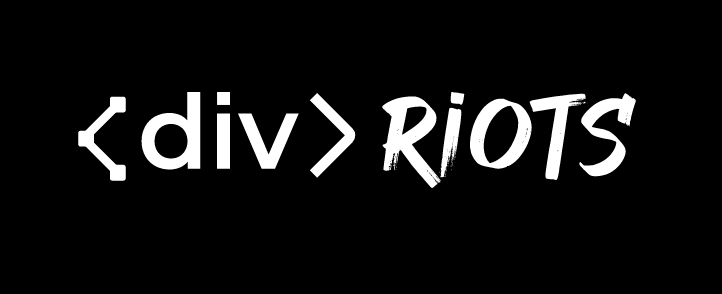
Brackets
While being a clear mark of our attachment to the developer world, the first bracket < is a reference to the design environment. Reminiscent of the pen tool, anchor points are used to create the shape, and act as entry point to the logo.
Incorporating that first bracket into the well known <div> is our way to show that if our products are technically developer-centric, we keep the designer community at the center.
div
We build tools for developers, and more specifically web developers. What could be more iconic than an HTML <div> tag to proclaim our love to the code-side?
We use a specific font for it’s proportional geometry, yet we changed the —i— dot into a square as a reminder of a pixel and the raw side of code.
RIOTS
The RIOTS font is a bold illustration of our engagement: we stand by our mission to help frontend teams deliver better products, a lot faster. We are starting a revolution and as such we are purposely displaying our letters with a bold brush. While our revolution is virtual, the brush brings back the idea that there are analog beings behind it. We also added a square on the —i— to harmonize the whole visual.
We hope you like our new branding (and you find this small article interesting 😉)