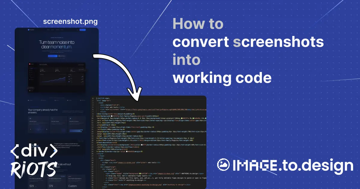
How to convert screenshots into working code
-

- Name
- Pierrick
- @S3kelman1
You have a screenshot of a UI — a landing page mock-up, a competitor’s layout, or a design saved as a flat image — and you need working HTML from it. Not an <img> tag embedding the picture, but actual front-end code that recreates what’s in that image: the buttons, the typography, the layout structure.
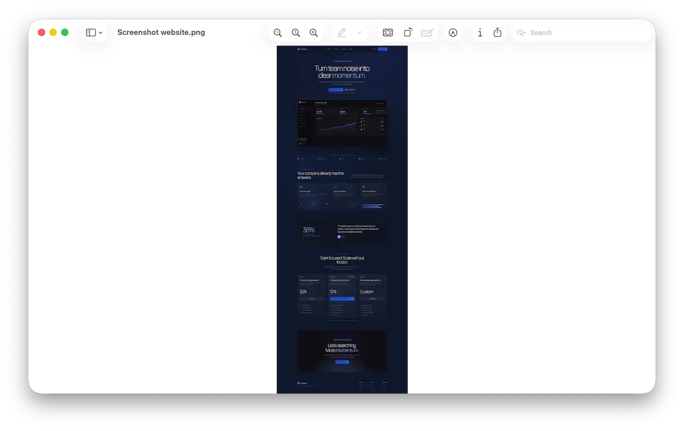
image.to.design converts screenshots and images into HTML you can copy or download, directly in the browser. Upload a screenshot, get structured HTML and CSS back in seconds — no API key, no local setup, no prompt engineering. This guide walks through the full process, explains what to expect from the output, and compares image.to.design against LLMs and other converters.
💡 Need to convert images to HTML at scale? The ‹div›RIOTS API exposes the same engine programmatically — batch-convert hundreds of screenshots without touching the browser.
Quick guide
Step 1. Open image.to.design in your browser.
Step 2. Drop your screenshot into the upload area, paste it from your clipboard, or click to browse for the file.
Step 3. Wait a few seconds while the image is analyzed and converted.
Step 4. Copy the generated HTML code or download it as a file.
Step 5. Paste the code into your project or LLM and adjust as needed.
Detailed tutorial
Step 1: Prepare your screenshot
A clean, high-resolution PNG gives the best results. Crop out browser chrome, OS-level UI elements, and anything that isn’t part of the design you want to convert. Crop tightly. If you only need the hero section, crop to that section. A full-page screenshot with a cookie banner, navigation, footer, and main content gives the AI more to interpret — and more room to misinterpret.
Step 2: Upload the image to image.to.design
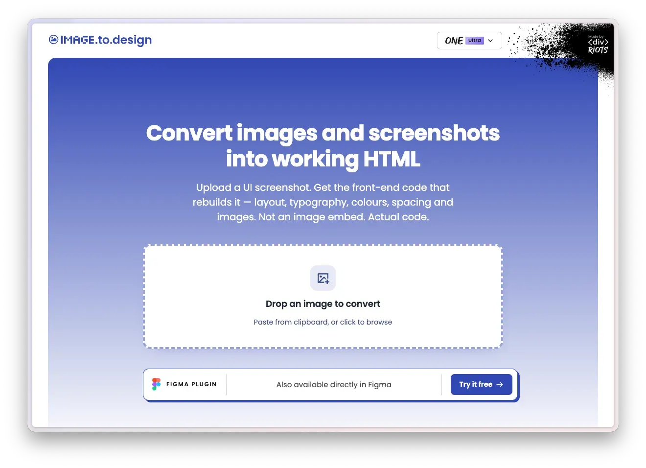
Go to image.to.design. You have three ways to get your image in:
- Drag and drop the file directly onto the upload area.
- Paste from clipboard — take a screenshot with your OS shortcut and paste it straight in, no need to save a file first.
- Click to browse your file system and select the image.
The tool accepts common formats: PNG, JPG, WebP, and more. Each conversion costs a variable number of credits depending on image complexity. First-time signups get 20 credits to start, plus 10 credits per month on the free plan — no credit card required.
Step 3: Pick your quality
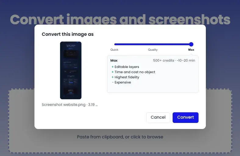
After uploading, a slider lets you choose between three conversion modes:
- Quick — 20+ credits, ~3–5 minutes. Produces editable layers, text layers, bitmap assets, and vector shapes. Optimized for speed.
- Quality — 100+ credits, ~5–10 minutes. Same output types as Quick, but optimized for the quality/speed/cost balance.
- Max — 500+ credits, ~10–20 minutes. Highest fidelity. Time and cost are no object — this is for when the output needs to be as close to the original as possible.
All three modes produce structured, editable HTML. The difference is how much time and credits the engine spends on precision. For a rough layout reference, Quick is enough. For a production starting point, Quality or Max is worth the wait.
Step 4: Copy or download the HTML
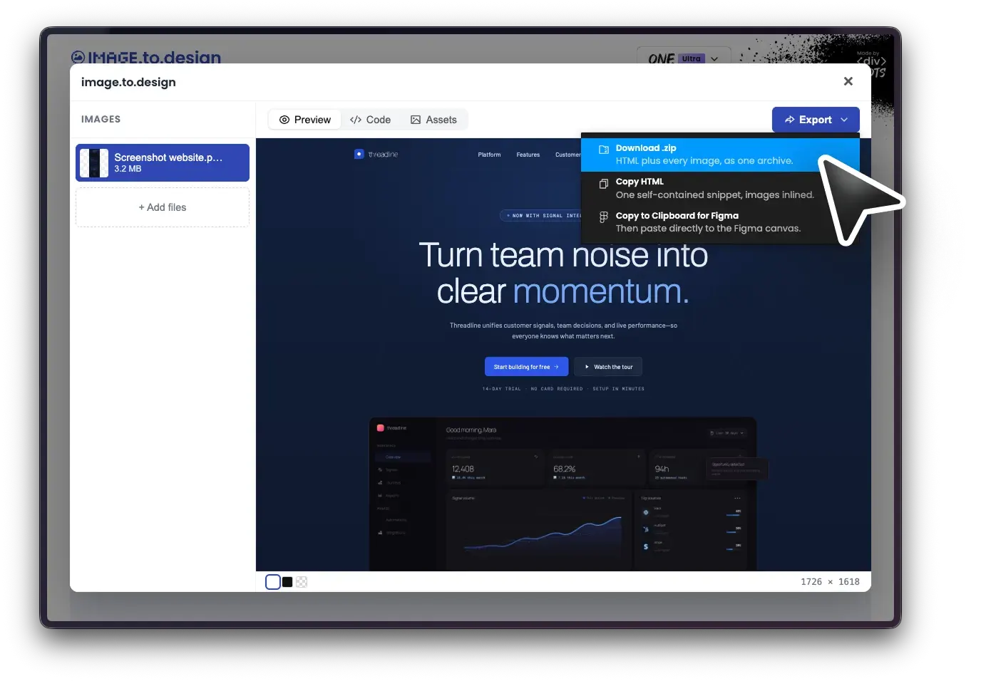
When conversion finishes, you get HTML code you can:
- Copy to clipboard and paste directly into your editor or code sandbox.
- Download as a file to drop into an existing project.
Step 5: Review and refine
The generated HTML is a high-fidelity starting point. Expect to adjust:
- Placeholder content. Real text from your screenshot is preserved where detected, but some elements may need manual correction — especially small text, unusual fonts, or overlapping elements.
- Responsive behavior. The output reflects the fixed dimensions of your screenshot. You’ll likely need to add media queries or responsive utilities if you’re building for multiple breakpoints.
- Semantic HTML. The conversion produces structurally accurate code, but you may want to swap generic
<div>elements for semantic tags like<nav>,<section>, or<article>depending on your accessibility and SEO requirements.
What Gets Converted
Text and typography. Headings, body text, labels, and button text are extracted and placed into corresponding HTML elements. Font sizes, weights, and colors are mapped to CSS properties. The tool reads the visual hierarchy of your screenshot — larger, bolder text becomes headings; smaller text becomes paragraphs or labels.
Layout structure. Rows, columns, cards, and grid patterns in your screenshot are translated into CSS layout (flexbox and positioning). Spacing between elements is measured from the image and applied as padding and margins.
Colors and backgrounds. Background colors, text colors, and gradients visible in the screenshot are sampled and applied as CSS values. If your screenshot includes a background image, it’s typically embedded or referenced as a placeholder.
Images and icons. The engine detects photographs, illustrations, and icons embedded in your screenshot, cuts them out of the source image, and places them back into the generated HTML as standalone assets. A hero image, a product photo, a logo — each one is extracted and positioned in the layout as closely as possible to the original. This means the output isn’t a flat rendering with baked-in visuals; the images are separate elements you can swap, resize, or replace.
What it won’t do. The tool works from a flat image — it doesn’t have access to the original source code, design tokens, or component library behind the UI. It can’t infer hover states, animations, or JavaScript interactions from a static screenshot. These are elements you add after the structural HTML is in place.
Benefits
Skip the manual rebuild. Recreating a UI layout from a screenshot by hand — measuring spacing, eyeballing colors, typing out text — takes 30 minutes to several hours depending on complexity. image.to.design compresses that to seconds.
No tooling overhead. No npm packages to install, no API keys to manage, no Python environments to configure. Open a browser tab, drop in your image, get code. You get 20 credits on signup and 10 per month on the free plan — no credit card required.
Works with the tools you already use. The HTML output drops into any front-end workflow: React, Vue, plain HTML, a code sandbox, a CMS template, or your LLM of choice. Copy, paste, and keep moving.
Part of a broader ecosystem. image.to.design is also available as a Figma plugin — same name, complementary output.
Use Cases
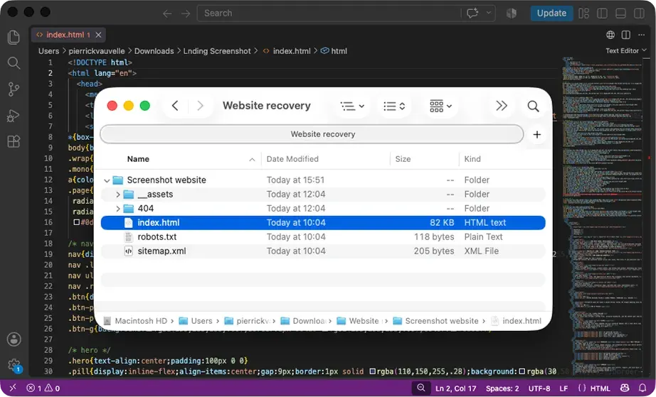
- Recovering a lost website. Hosting expired, CMS crashed, previous developer disappeared with the source files. Screenshot the archived version on the Wayback Machine, drop it into image.to.design, and get a working HTML reconstruction instead of paying a restoration service or rebuilding from memory.
- Extracting email templates. A marketing email lands in your inbox with a layout worth reusing. Screenshot it and convert to clean HTML — faster than reverse-engineering the mangled inline styles in raw email source code.
- Competitive analysis. Screenshot a competitor’s landing page and convert it to HTML to study their layout structure, spacing system, and component hierarchy — without rebuilding anything by hand.
- Freelance client handoff. A client sends you a flat mockup from Canva, Photoshop, or a PDF and asks you to “make it a website.” Convert the image to HTML to get a structural starting point with real spacing and layout, then build from there instead of eyeballing every pixel.
Image to HTML: Online converters vs. AI tools vs. image.to.design
Method 1: Online Image-to-HTML Converters
Search for “image to HTML converter” and most results fall into this category. These tools base64-encode your image and wrap it in an <img> tag, or run basic OCR to extract text into minimal HTML. The result is either a data URI that embeds the original picture — not a reconstruction — or a rough text dump with no layout structure. If you need usable front-end code that reproduces a UI, they don’t work.
Method 2: AI screenshot-to-code tools (ChatGPT, Claude, Gemini)
Pasting a screenshot into a chat-based AI and asking for HTML is the most popular approach right now. It produces plausible results for simple layouts, but has two structural limitations that cap its quality ceiling.
The first is resolution. Major LLM silently downscales your image before the model ever sees it. GPT-4o scales images to fit a 2048×2048 bounding box, then further reduces the shortest side to 768px. Claude caps the long edge at 1568px. A full-page screenshot — say, 1440×8000px — gets compressed to roughly 1440×2048 or smaller before a single pixel is analyzed. Fine details like small text, icon shapes, and precise spacing are lost in the downscale. The model then guesses at what those details were, which is why LLM-generated HTML typically gets spacing, fonts, and complex layouts wrong.
The second is approach. LLMs generate HTML from a broad impression of what the image looks like. They approximate layout rather than measuring it. The output is a plausible sketch, not a faithful reproduction — and for anything beyond the simplest UI, it needs so much correction that you’d have saved time writing the code from scratch.
Method 3: image.to.design — Reconstruction, Not Approximation
image.to.design takes a fundamentally different approach. Rather than generating HTML from an impression, our engine performs a deep structural analysis of the image — identifying actual visual hierarchy, spatial relationships, typographic patterns, and layout logic. The result is a reconstruction: structured, production-quality HTML that faithfully reproduces what you see in the source image.
Where LLMs top out at 2048px, image.to.design handles screenshots up to 100,000px long. A full-page capture of an entire marketing site, a long dashboard, a multi-screen mobile flow stitched together — the engine processes the full image at full resolution without downscaling or losing detail.
The trade-off is processing time: complex images can take several minutes rather than seconds.
This engine is the same one that powers our Figma import plugins and the ‹div›RIOTS API — built from years of solving the hardest conversion problems in design tooling: code to design, and back.
Conclusion
image.to.design converts screenshots to structured HTML in your browser — upload an image, copy or download the code, paste it into your project.
If your workflow is Figma-first, the same technology is available as a Figma plugin that converts screenshots to editable layers. And once you’re in Figma, figma.to.code takes your designs back to HTML in one step. The full loop — image to design to code — is covered.
Try image.to.design for free — 20 credits on signup, 10 per month after that. No credit card required; no setup. Paste an image in and see what comes back!
For a full reference on the web tool, the Figma plugin and the API — including output formats and quality tiers — see the image.to.design documentation.