GPT-5.6 Sol vs Terra vs Luna: Which ChatGPT Model Generates the Best Designs in Figma?
-

- Name
- Pierrick
- @S3kelman1
OpenAI just shipped three models instead of one. GPT-5.6 Sol, Terra, and Luna each sit at a different price-performance tier — and each produces noticeably different results when you use them to generate designs directly inside Figma.
We ran all tests through ai.to.design, our Figma plugin to generate design from any AI, directly in Figma. Two tests, same prompts, three models: a SaaS landing page and a mobile running coach app. Here’s how the results compare from a design perspective — and which model you should pick depending on what you’re building.
TL;DR
- GPT-5.6 Sol produced the most complete, production-ready layouts — tighter spacing, more intentional hierarchy, and the deepest content structures. Strongest overall.
- GPT-5.6 Terra made the most distinctive visual choices — mixed typography, unexpected color palettes, editorial compositions. The most “designed” feel of the three.
- GPT-5.6 Luna delivered clean, functional layouts with solid UX foundations. Less visual personality, but a reliable wireframe-grade starting point.
- All outputs landed on the Figma canvas as fully editable layers — text, frames, auto-layout containers, shapes — ready for immediate modification.
Test 1: SaaS Landing Page
We prompted each model to design a dark-themed SaaS landing page for a team productivity tool, with a hero section, feature highlights, pricing tiers, and a CTA.
Sol — “Threadline”
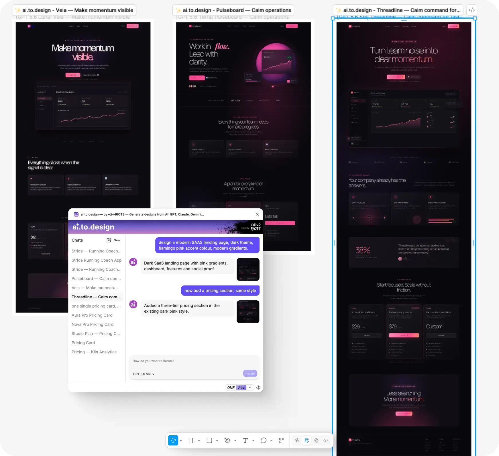
Sol’s output felt the closest to a real product page. The visual hierarchy did most of the work: a clear weight progression from a large hero headline down through feature cards, social proof, pricing, and a final CTA. Every section had enough breathing room to feel intentional, not crammed.
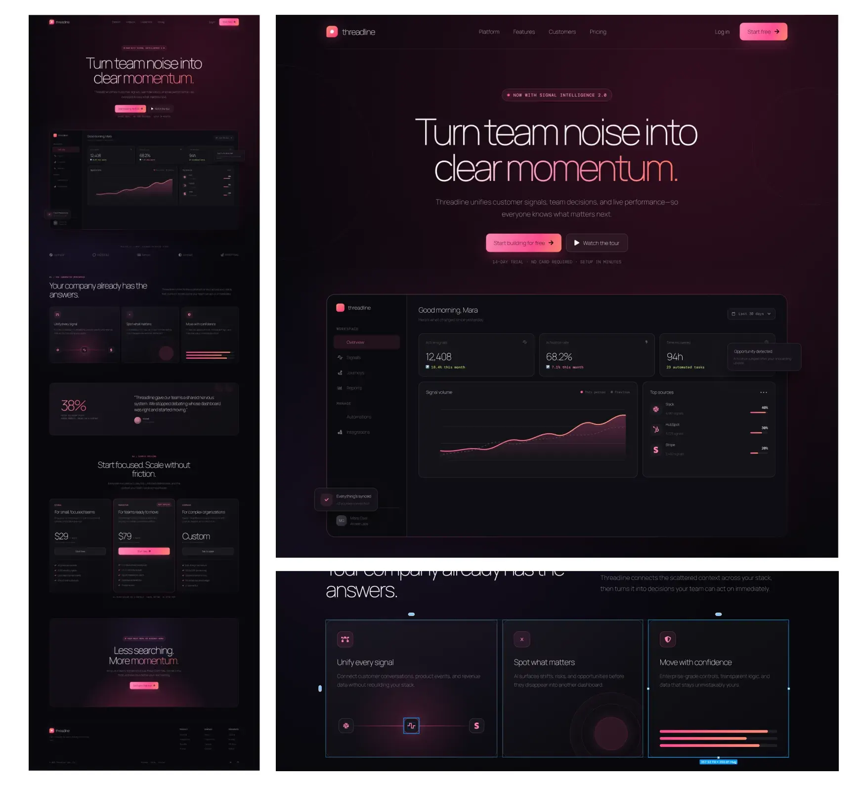
The dark theme with coral/pink accents was cohesive — one accent color carried throughout without competing elements. The hero embedded a dashboard UI mock that gave the page immediate context: yes it’s still an AI filler but we didn’t give it much context to work with. Feature cards used consistent icon styles and short descriptions. The pricing section read clearly, with the three tiers visually balanced and the “Most Popular” badge drawing the eye to the middle option.
Where it plateaued: the layout ran long — seven-plus sections — and the repetitive dark-on-dark treatment made the lower sections feel like they blurred together. Trimming one or two sections and adding a contrasting background break would sharpen the pacing. Sol also leaned into a specific dark SaaS aesthetic that Design Arena has documented as a recurring GPT-5.6 tendency — polished, but recognizably “AI-generated” to a trained eye.
Terra — “Pulseboard”
Terra was the typographic standout. The hero mixed a serif italic (“flow”) with a clean sans-serif at large scale — the kind of deliberate type pairing you’d expect from a designer, not a model. That single choice gave the whole page more visual personality than anything Sol or Luna produced.
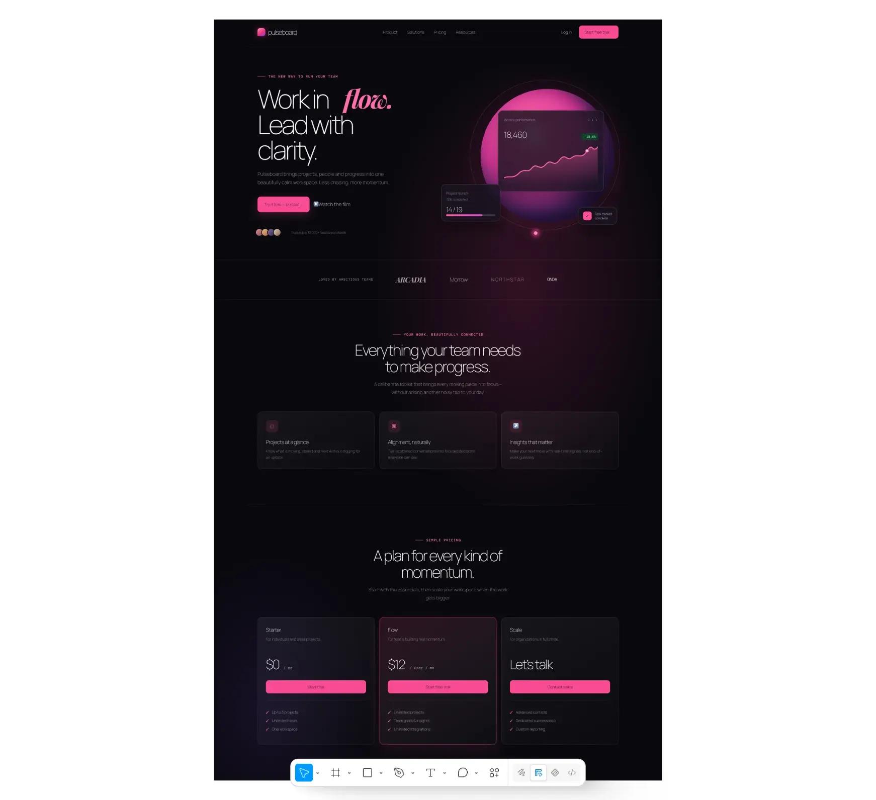
The composition was confident and restrained. A split hero (copy left, product visual right) with generous whitespace. No dashboard mock shoved into the hero — just a clean performance chart that communicated “analytics tool” without overcomplicating the first impression. The pricing section used a freemium structure ($0 / $12 / Custom) with clear tier differentiation.
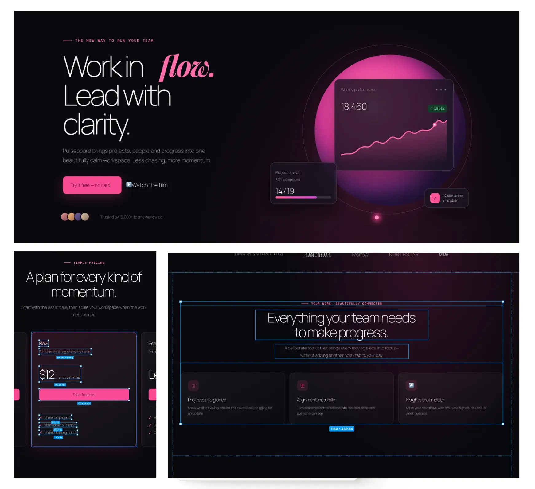
Where it fell short: Terra produced the shortest page of the three — hero, features, pricing, done. No testimonial block, no secondary CTA, no product walkthrough. The feature cards (“Projects at a glance,” “Alignment, naturally”) were well-composed visually but the copy underneath was thin. If you need a complete landing page, you’re adding sections in Figma. But as a design direction — a mood and a visual system to build from — Terra gave the strongest foundation.
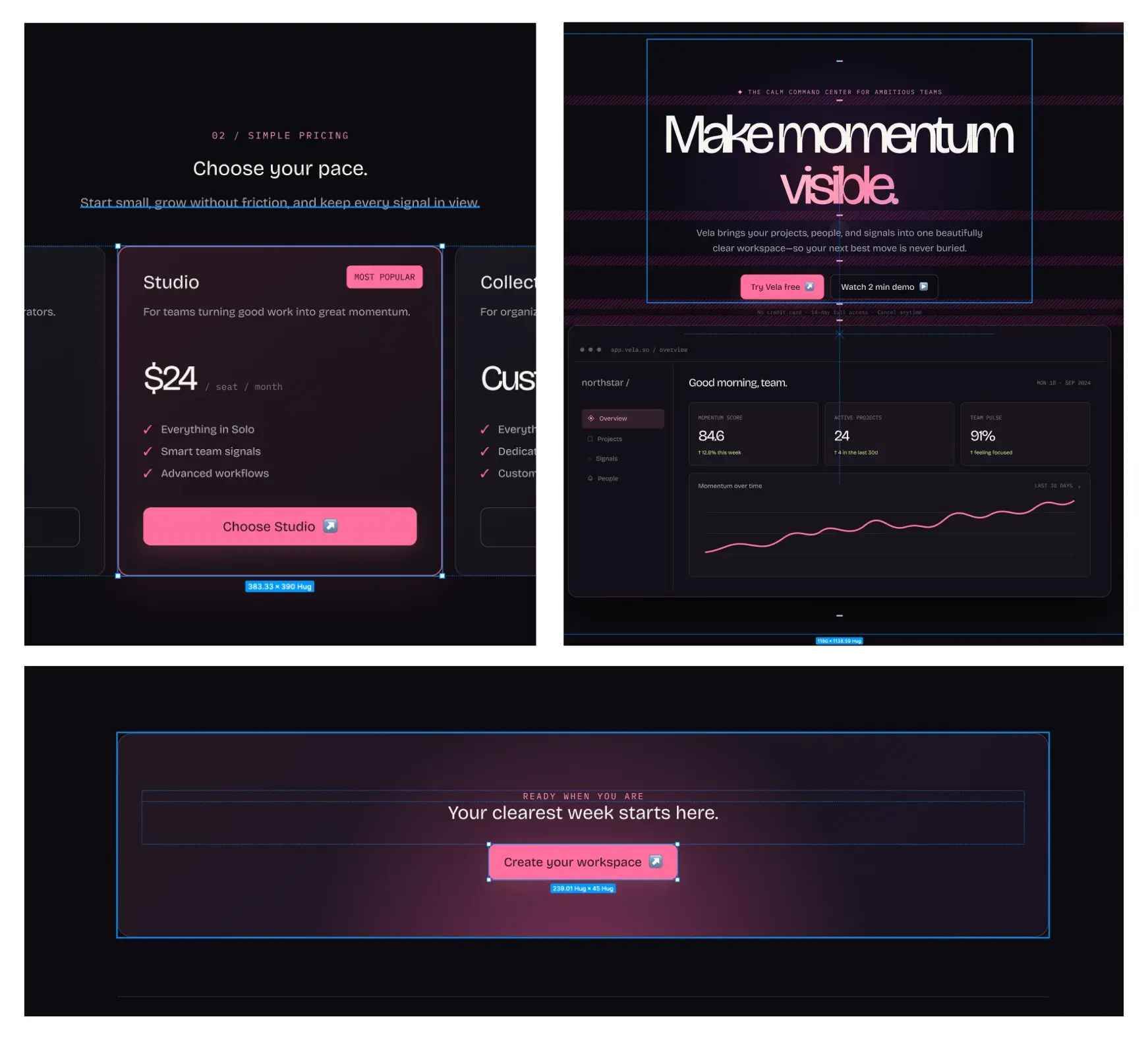
Luna — “Vela”
Luna produced a clean, predictable layout. Every section made sense structurally: hero → value proposition → features → pricing → CTA. The flow was logical, the spacing was even, and nothing felt broken.
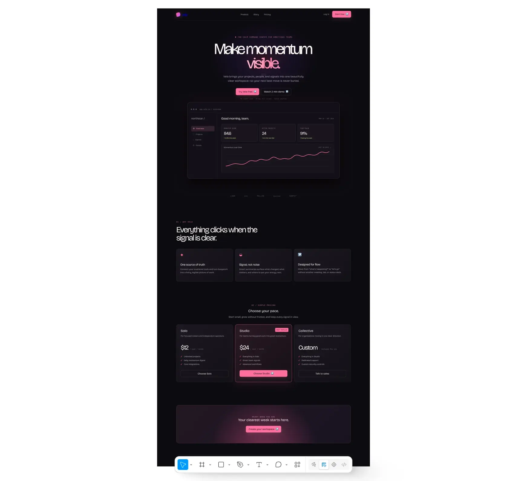
But nothing surprising, either. The typography was safe — one weight, one size scale, no editorial choices. The feature cards were well-aligned but visually flat. The color treatment (dark theme, teal-ish accents) felt like a default rather than a decision. The overall impression was a competent wireframe with real content — good bones that need a design pass before they’re presentable. Luna’s output works best when you’re not looking for a visual direction, just a fast structural starting point to restyle.
Test 2: Mobile Running Coach App
Same setup, different brief: design three mobile screens for a running coach app called “Stride” — a welcome/onboarding screen, a weekly training plan, and an activity tracking view.
This test revealed more separation between the models than the landing page did, because mobile UI demands tighter component design, consistent spacing systems, and coherent navigation patterns. There’s less room to hide behind big hero sections.
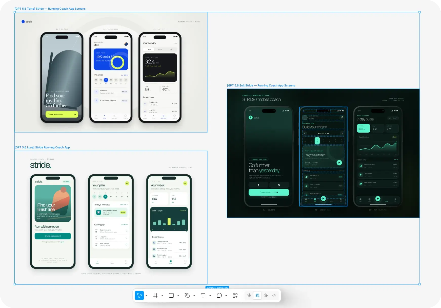
Sol — Polished dark UI, closest to a real app
Sol committed to a dark theme with mint/green accents and didn’t break from it across all three screens. That consistency mattered — the screens looked like they belonged to the same app, not three separate concepts.
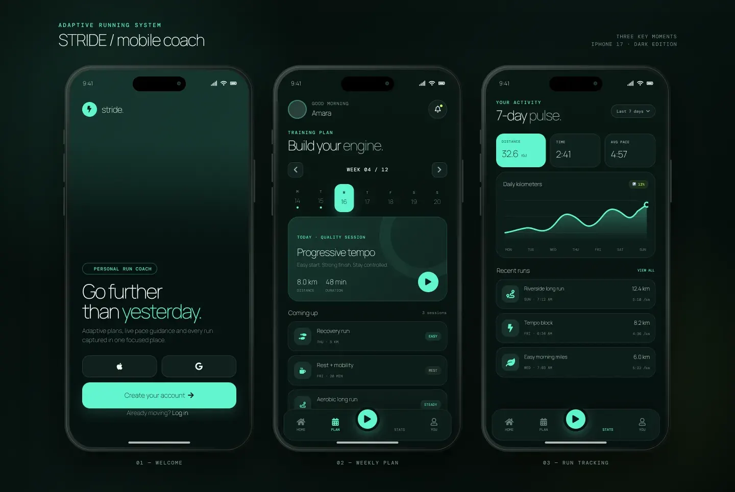
The welcome screen had clear visual weight: large headline, supporting text, two sign-in options, a primary CTA, and a secondary “Log in” link — all stacked in the right priority order. The weekly plan screen was the most impressive of any output across both tests. A calendar strip, a highlighted session card with a play button, and upcoming sessions with difficulty tags — the component hierarchy felt like a real training app, not a generic list. The activity screen used a line chart with labeled axes, stat cards, and a recent runs list that maintained the same visual language as the rest.
The five-tab bottom navigation (Home, Plan, Play, Stats, You) was the most complete, though you could argue it’s one tab too many for a focused app. Overall, Sol’s mobile output was the most shippable — you could hand this to a developer and they’d understand the intent without guessing.
Terra — Original visual direction, lack of cohesion
Terra made the boldest individual choices — but they didn’t hold together as a system.
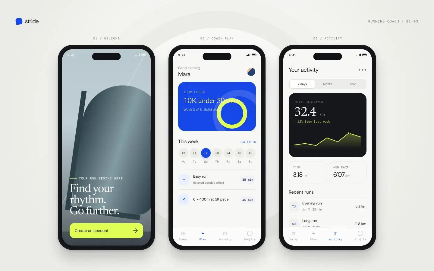
The three screens looked like three different apps. The welcome screen used a moody photographic background with a lime green CTA. The plan screen switched to a light theme with a bold blue focus card. The activity screen introduced a dark data card on a light background with a yellow-green chart. Three different accent colors, three different surface treatments, no shared visual language tying them together. If a junior designer handed you these screens, you’d probably send them back.
Individual screens had strong moments — the plan screen’s information hierarchy was clear, and the four-tab navigation (Today, Plan, Activity, Profile) was tighter than Sol’s five-tab bar. But strong fragments don’t make a cohesive app. Terra’s mobile output is the one that needs the most rework in Figma: pick one of the three visual directions, then apply it consistently across all screens. The raw material is interesting — the execution isn’t.
Luna — Clean and functional, needs styling
Luna went light and warm — cream backgrounds, green accents, an illustrated runner on the welcome screen. The approachable tone has a valid design direction.
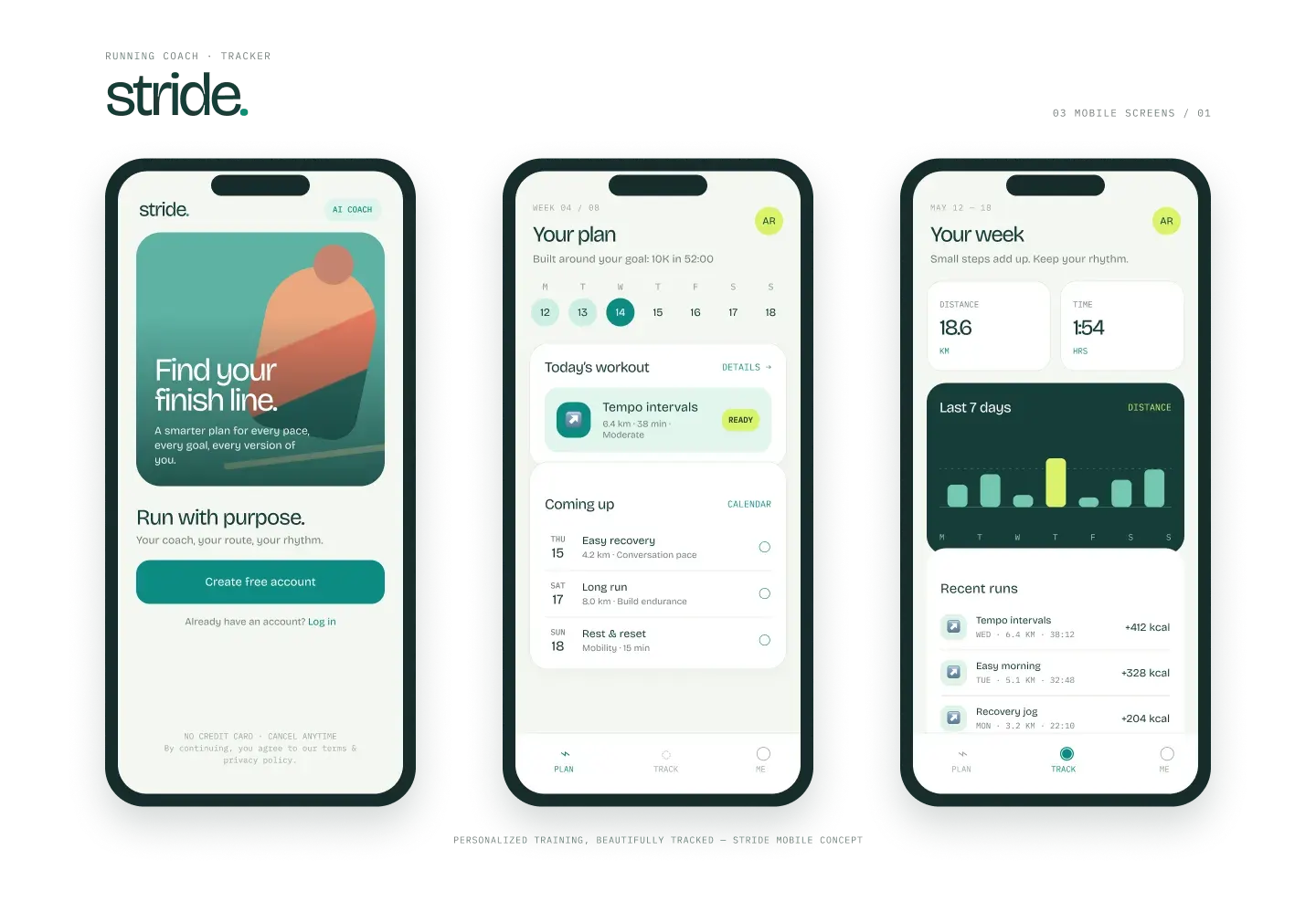
The welcome screen illustration set a friendly mood, though the drawing style looked generic rather than branded. (keep in mind that the prompt was lacking specific directions) The plan screen had solid information hierarchy — goal at top, today’s workout in the middle, upcoming sessions below — but the component styling was minimal. White cards on a light background, basic list separators, no elevation or color differentiation between elements. The tracking screen used a bar chart and recent runs list — functional, scannable, but visually flat.
The biggest UX win from Luna was the three-tab navigation (Plan, Track, Me) — the simplest and arguably the most focused nav pattern of the three. It also included calorie data in the run history, which the other models skipped — a smart detail for a fitness app.
Luna’s mobile output felt like a well-organized wireframe. The structure was right, the information architecture made sense, but the visual layer needed work. Use it as a skeleton, then apply your own color system, typography, and component styles in Figma.
How to Generate Designs with GPT-5.6 in Figma
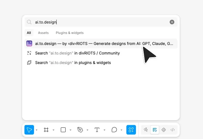
Step 1: Install ai.to.design
Open any Figma file, search and run ai.to.design.
Step 2: Write your prompt
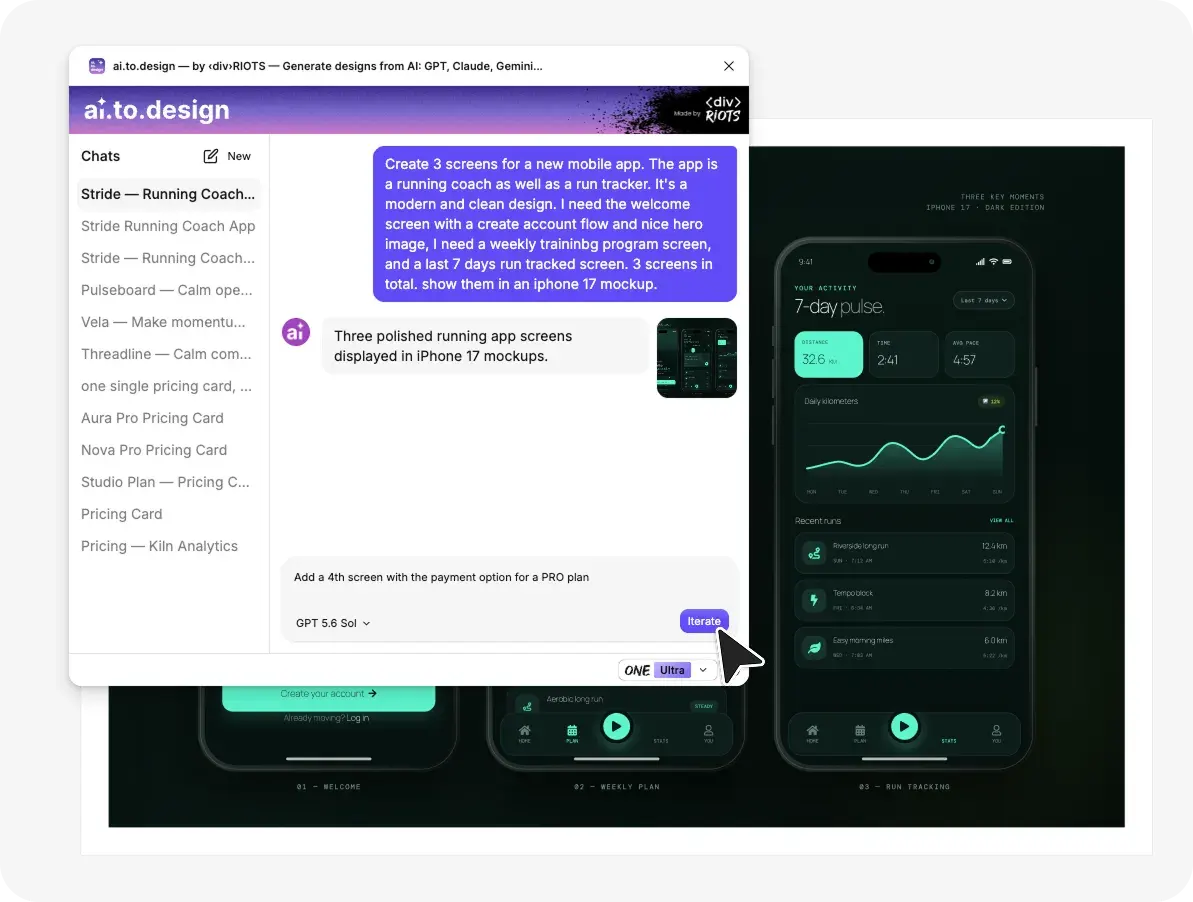
Describe what you need — page type, screens, style, color scheme, content details. For a mobile app, specify the number of screens, the screen names, and the platform. The more concrete your prompt, the less guesswork the model does.
Step 3: Select your model
Pick GPT-5.6 Sol, Terra, or Luna from the model selector. ai.to.design supports all three tiers, plus Claude, Gemini, Grok, DeepSeek, and GLM — so you can compare outputs across providers for the same prompt without leaving Figma.
Step 4: Generate and edit
Click Generate. The plugin converts the AI output into native Figma elements — frames, text layers, shapes, auto-layout containers. You can then continue to prompt, or start editing manually, every element is individually editable. Rename layers, swap colors, adjust spacing, apply your design system tokens.
Which Model to Pick
After running both tests, the ranking depends on what you value.
Pick Sol for (close to) production-ready output. Sol’s layouts had the tightest spacing, the most complete content, and the strongest visual consistency across sections and screens. If you need something that looks close to finished — for a client review, a stakeholder presentation, or a dev handoff starting point — Sol gets you furthest with a single prompt. It’s OpenAI’s flagship tier and the first GPT model to rank #1 on Design Arena’s web design leaderboard.
Pick Terra for visual exploration — with caveats. Terra made the most interesting individual design decisions: mixed typography on the SaaS page, editorial photography and unexpected color choices on the mobile app. But it struggled with consistency across screens — its mobile output looked like three separate concepts rather than one app. Terra is the model to use when you’re hunting for a visual direction, not a complete layout. Grab the strongest idea from its output, then build a consistent system around it in Figma. It costs less than half of Sol.
Pick Luna for fast iteration. At $0.20/$1.20 per million tokens after OpenAI’s July 2026 price cut, Luna is 25x cheaper than Sol. Generate ten layout variations, pick the strongest structure, then refine in Figma or re-generate with Sol or Terra for the visual polish. Luna’s outputs are reliable wireframes, and that’s exactly what early ideation needs.
The real advantage of ai.to.design is that you don’t have to choose one model upfront. Run the same prompt through Sol, Terra, and Luna in under five minutes, get three distinct directions on your canvas, and pick the best starting point. You can also compare across AI providers entirely — Claude, Gemini, GPT — from the same plugin. Our introductory guide covers how different providers handle the same design prompt, and our GPT-5.4 comparison shows how each GPT generation has improved.
FAQ
Q: Can I use GPT-5.6 Sol, Terra, and Luna directly in Figma? Yes. ai.to.design supports all three GPT-5.6 tiers. Select the model from the dropdown, write your prompt, and the plugin generates editable Figma layers on your canvas. Switch between Sol, Terra, Luna, and other providers (Claude, Gemini, Grok) without leaving Figma.
Q: Are GPT-5.6 Sol, Terra, and Luna different models? They are three tiers of the same GPT-5.6 family. Sol is the flagship (highest quality, highest cost), Terra is the balanced mid-tier, and Luna is the fastest and cheapest.
Q: Do I need a ChatGPT subscription to use these models in Figma? No. ai.to.design connects to the models directly — you don’t need a separate ChatGPT or OpenAI subscription. The plugin handles the AI connection, so you can use Sol, Terra, or Luna regardless of your OpenAI plan.